During my time as a student, I had the opportunity to be a Teacher's Assistant for "How Type Works", a typography course designed to teach the basics for non-designers. It was an incredible experience to help teach the importance of good type and how it can affect your work. To close the course off and end my time as an assistant, I created a zine detailing the key components of making good type.
I wanted to relate to the students by hand-illustrating and lettering the entire zine, as the majority of them came from illustration backgrounds. They were folded, hand-cut, stapled, and given to students on the date of the final exam.
A book detailing how to make good type. Designed using Procreate and Adobe InDesign
Original Idea
As I was providing feedback to student's projects, I started to notice a trend on core principles that needed to be reviewed. While the mini exercises done to go over each principle was successful, when it came to using what they learned in a more open-ended project, they fell back on what they were doing before the course.
So how do you get students to start incorporating what they've learned into their own work?
Show it, using your work as an example.
So I created a book that not only showcases the principles of type, but gives an example on using and adapting typographic rules within your own style.

Original Covers
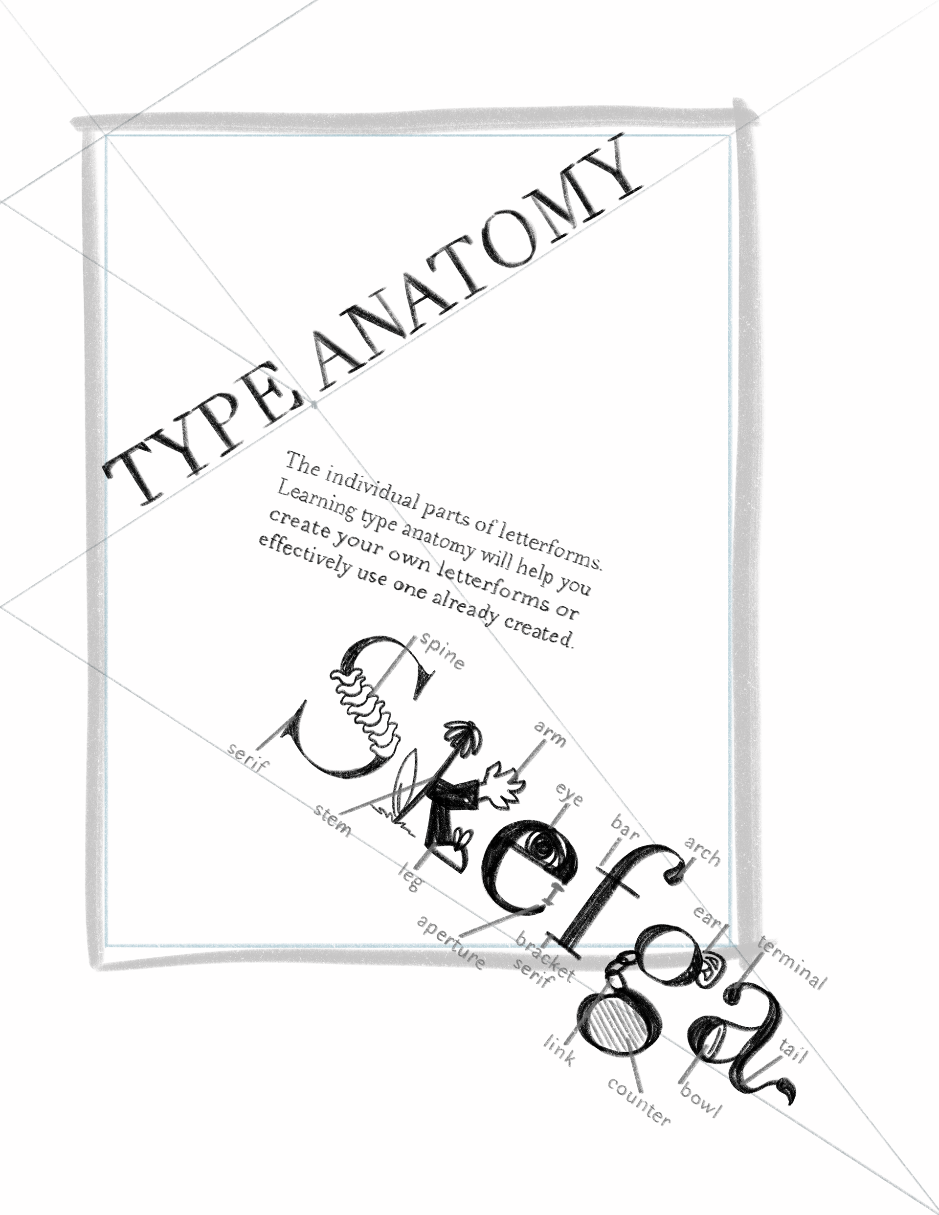
The original idea was to label the type anatomy of the title for the cover, since the main idea of the course was to learn how to see type everywhere.
I felt like it was too empty, and didn't fit with the vertical layout of the book, so instead I added a description of the course 'a class on how type works for non-graphic designers and the results', using type in a more experimental vs. traditional way.
I still felt like it wasn't hitting the mark, and wouldn't resonate with the students taking the course, so I pivoted– adding in an illustrated character on the cover to appeal to the heavy illustration and animation background of the students and show how both typography and illustration could be combined.


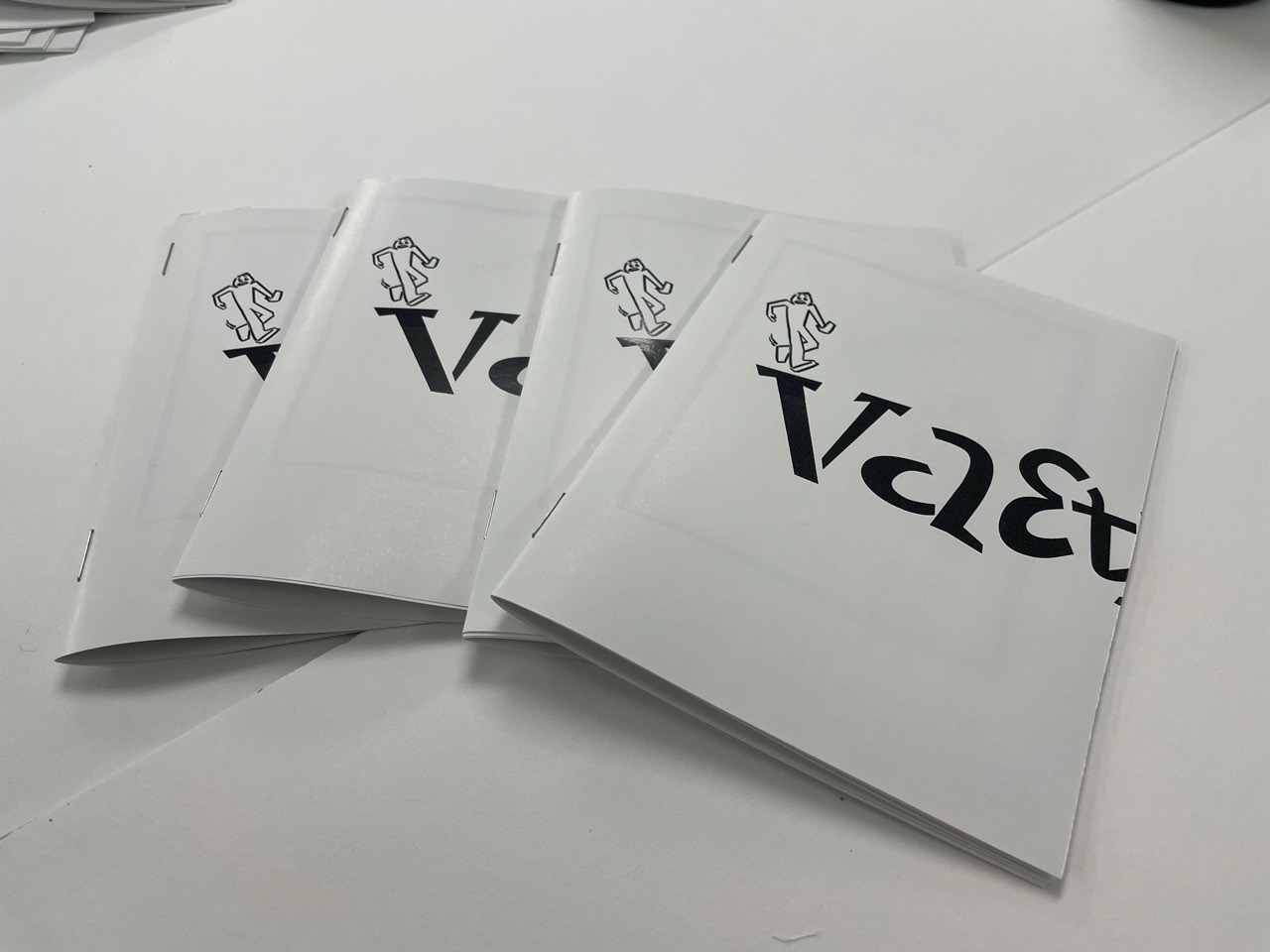
Final Cover
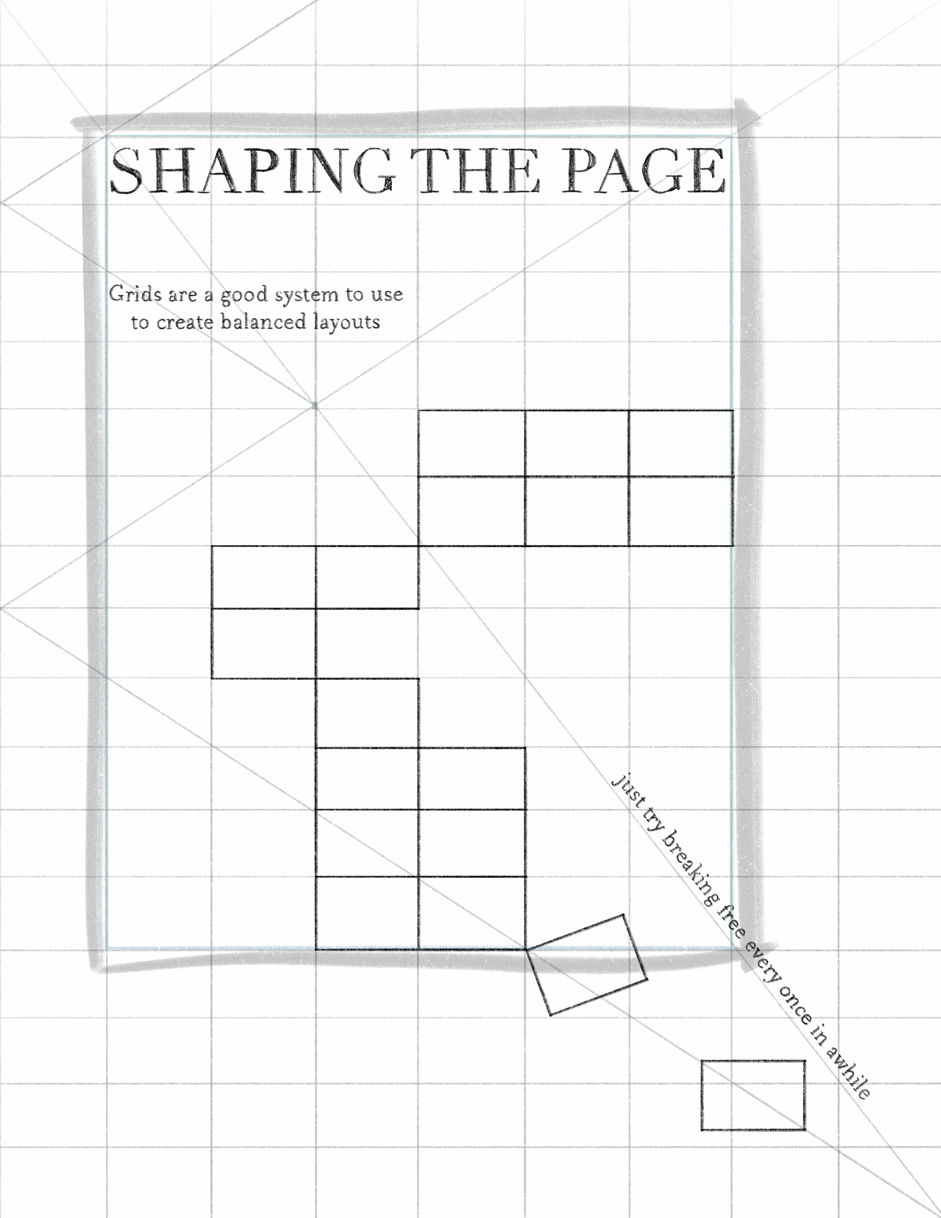
The final cover uses the core principles of typography (grids and hierarchy) in a fun way, having the character interact with the grid. The grid remaining visible allows non-designers to see how it's being used.
Throughout the book, a sketchy style is used because of the emphasis throughout the course to not run straight to the computer to create designs and type. Allowing yourself to work without the level of precision computer programs give allows for more iteration of ideas, especially when first starting out as a designer.

How Do You Communicate Typographic Rules to Illustrators?
As someone who transitioned from illustrator to designer, the answer was simple: create a visual way to remember rules.
When I first learned type anatomy, the only way I could remember the individual parts of letterforms was by picturing what they were called. I would picture the arm of a 'K' waving at me, the eye of an 'e' blinking at me, or a figure hanging off the bar of an 'f'.
So what better way to communicate that idea than illustrating it out? the fun, whimsical illustrations stick in your mind, and create connections between the names and parts that isn't typically taught in introductory type courses.

Final Book